Analytics
Track performance, audience, and revenue from your channel dashboard. The Analytics hub uses tabs across the top so you focus on one area at a time. Set the period for charts and tables with the date range control; it opens at Last 30 Days and lists the other presets and custom range options there.
Where to find it
Open Analytics in the left navigation. The page shows the title, the subtitle Track performance, audience, and revenue, and the tab row. The sections below follow that tab order. Each section includes a screenshot of that tab.
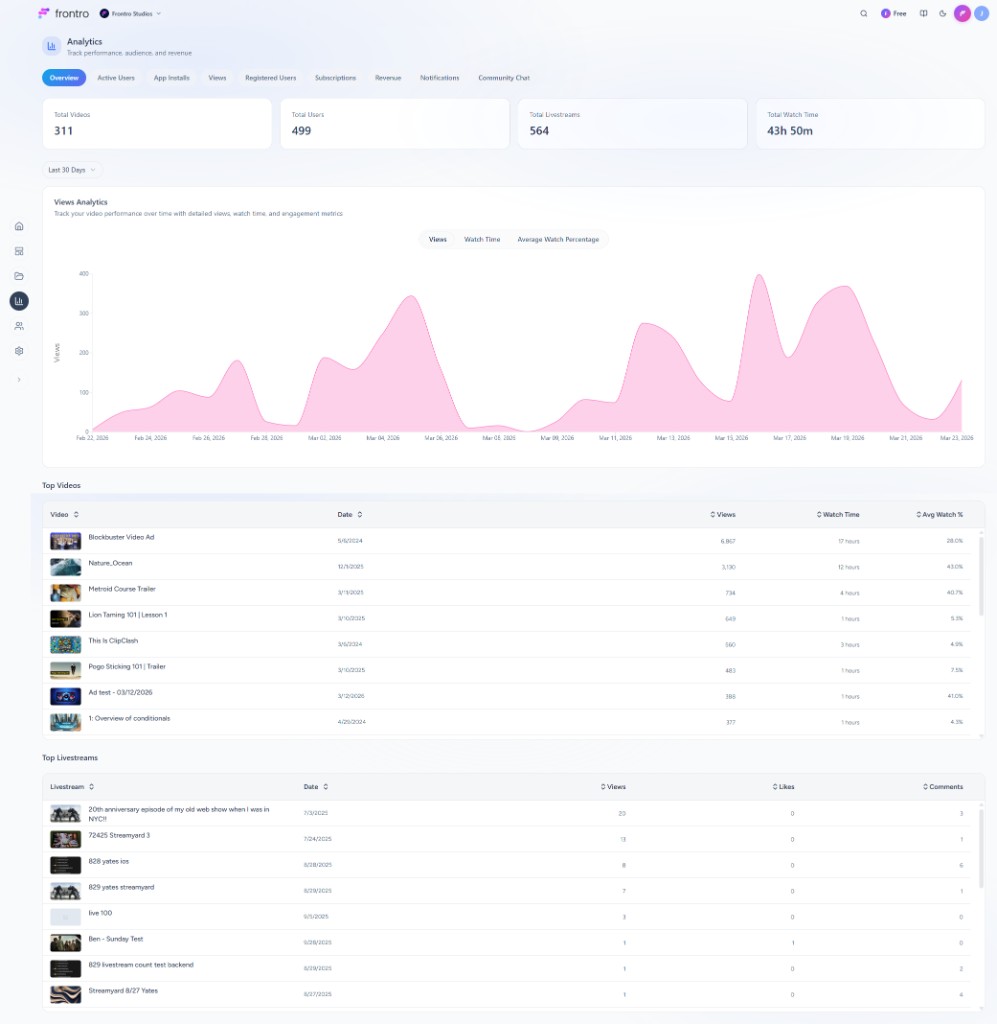
Overview
The Overview tab summarizes how your channel is performing.
- Summary cards — Total Videos, Total Users, Total Livestreams, and Total Watch Time.
- Views Analytics — Area chart for the selected range. Sub-tabs: Views, Watch Time, and Average Watch Percentage. Subtitle copy states you are tracking video performance over time with views, watch time, and engagement.
- Top Videos — Sortable table: thumbnail and title, date, views, watch time, average watch percentage.
- Top Livestreams — Sortable table: thumbnail, title, date, views, likes, comments.
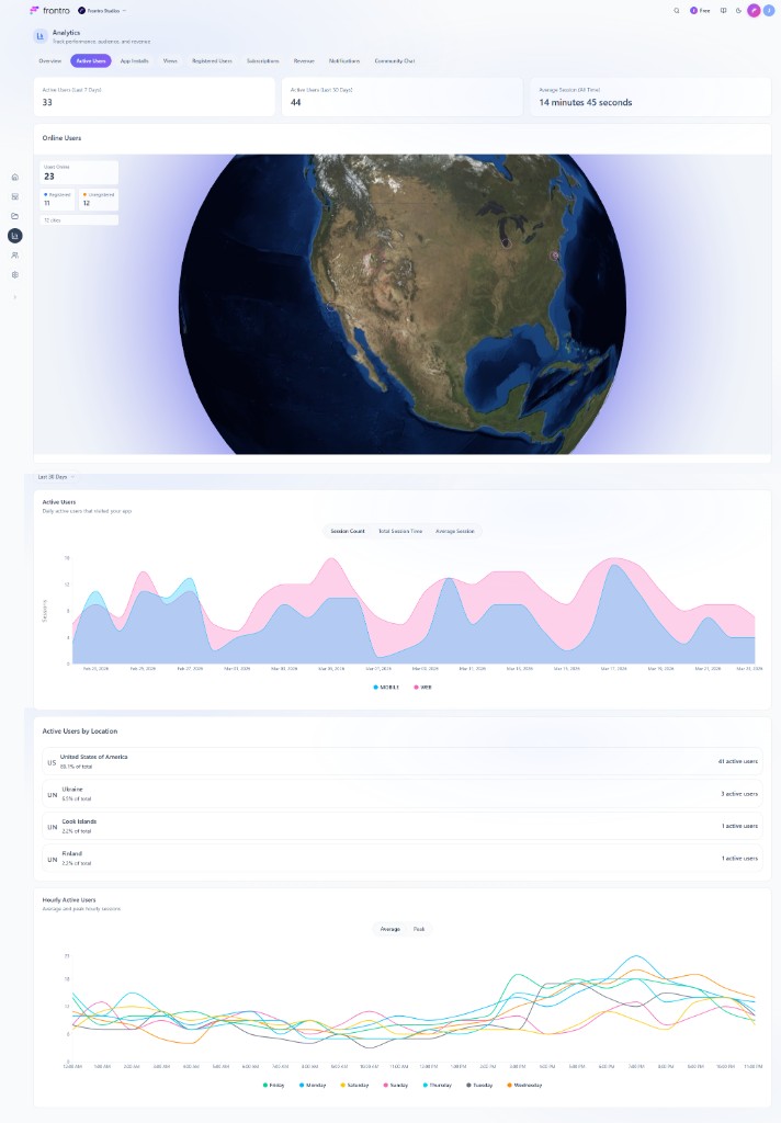
Active Users
The Active Users tab shows who uses your app and their session patterns.
- Summary cards — Active Users (Last 7 Days), Active Users (Last 30 Days), and Average Session (All Time).
- Online / geographic context — Map-style view with location markers, registered versus unregistered counts, and city count.
- Active Users chart — Stacked area chart (MOBILE vs WEB) with sub-tabs Session Count, Total Session Time, and Average Session.
- Active Users by Location — Country list with percentage of total and active user counts.
- Hourly Active Users — Intraday pattern with Average vs Peak and one line per weekday in the legend.
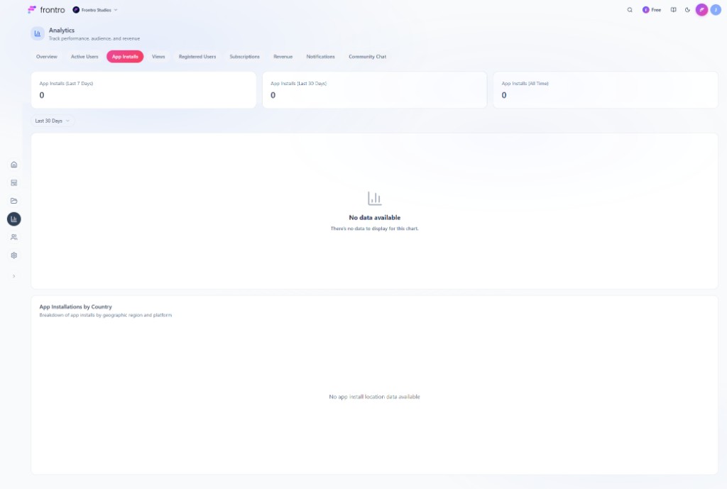
App Installs
The App Installs tab tracks mobile app installation activity.
- Summary cards — App Installs (Last 7 Days), App Installs (Last 30 Days), and App Installs (All Time).
- Installs over time — Time-series chart for the selected range.
- App Installations by Country — Geographic breakdown of installs.
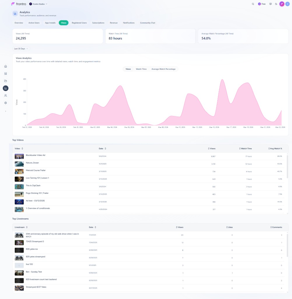
Views
The Views tab centers on video and stream consumption.
- Summary cards — Views (All Time), Watch Time (All Time), and Average Watch Percentage (All Time).
- Views Analytics — Same chart model as Overview: sub-tabs Views, Watch Time, and Average Watch Percentage, with the date range control for this tab.
- Top Videos and Top Livestreams — Tables for the period selected in the date range control.
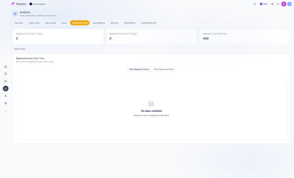
Registered Users
The Registered Users tab shows account growth.
- Summary cards — Registered Users (Last 7 Days), Registered Users (Last 30 Days), and Registered Users (All Time).
- Registered Users Over Time — Toggle New Registered Users vs Total Registered Users. The chart header describes new and total registered users for your app.
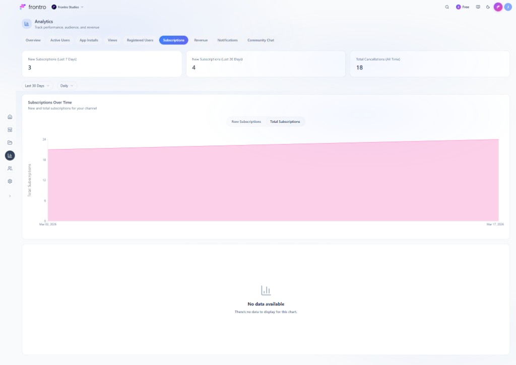
Subscriptions
The Subscriptions tab covers membership growth and cancellations.
- Summary cards — New Subscriptions (Last 7 Days), New Subscriptions (Last 30 Days), and Total Cancellations (All Time).
- Subscriptions Over Time — Area chart with Daily granularity and a toggle between New Subscriptions and Total Subscriptions.
- Cancelled Subscriptions Over Time — Chart below the first. It plots cancelled subscriptions per period from the cancelled-subscriptions analytics series—the same series the Total Cancellations (All Time) card rolls up into one all-time total. Title and description in the UI: Cancelled Subscriptions Over Time / Track subscription cancellations and churn patterns. Y-axis: Cancelled Subscriptions.
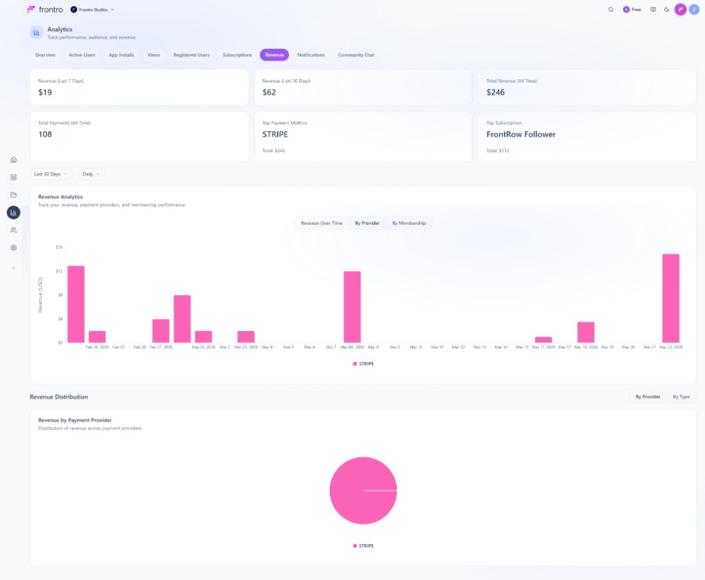
Revenue
The Revenue tab ties payments to trends and breakdowns.
- Summary metrics — Revenue (Last 7 Days), Revenue (Last 30 Days), Total Revenue (All Time), Total Payments (All Time), Top Payment Method, and Top Subscription. Top Payment Method and Top Subscription show subtext with running totals.
- Revenue Analytics — Chart with range and granularity controls; sub-tabs Revenue Over Time, By Provider, and By Membership.
- Revenue Distribution — Toggle By Provider / By Type; visualization is a pie chart.
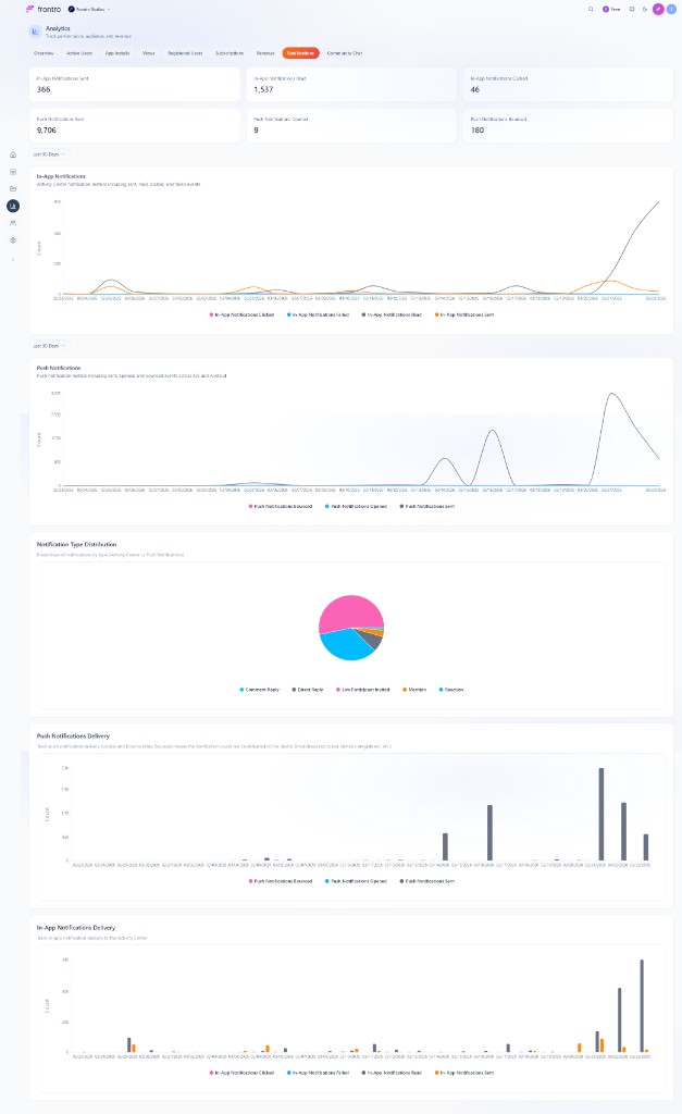
Notifications
The Notifications tab covers Activity Center (in-app) and push delivery.
- KPI cards — In-app: sent, read, clicked, failed. Push: sent, opened, bounced.
- In-App Notifications — Multi-series line chart over the selected period.
- Push Notifications — Line chart for push volume and engagement.
- Notification Type Distribution — Pie chart of volume by notification type. Read the legend on the chart for the exact type names and mix for your workspace.
- Delivery charts — Grouped bar charts for push and in-app delivery: success versus failure counts over time.
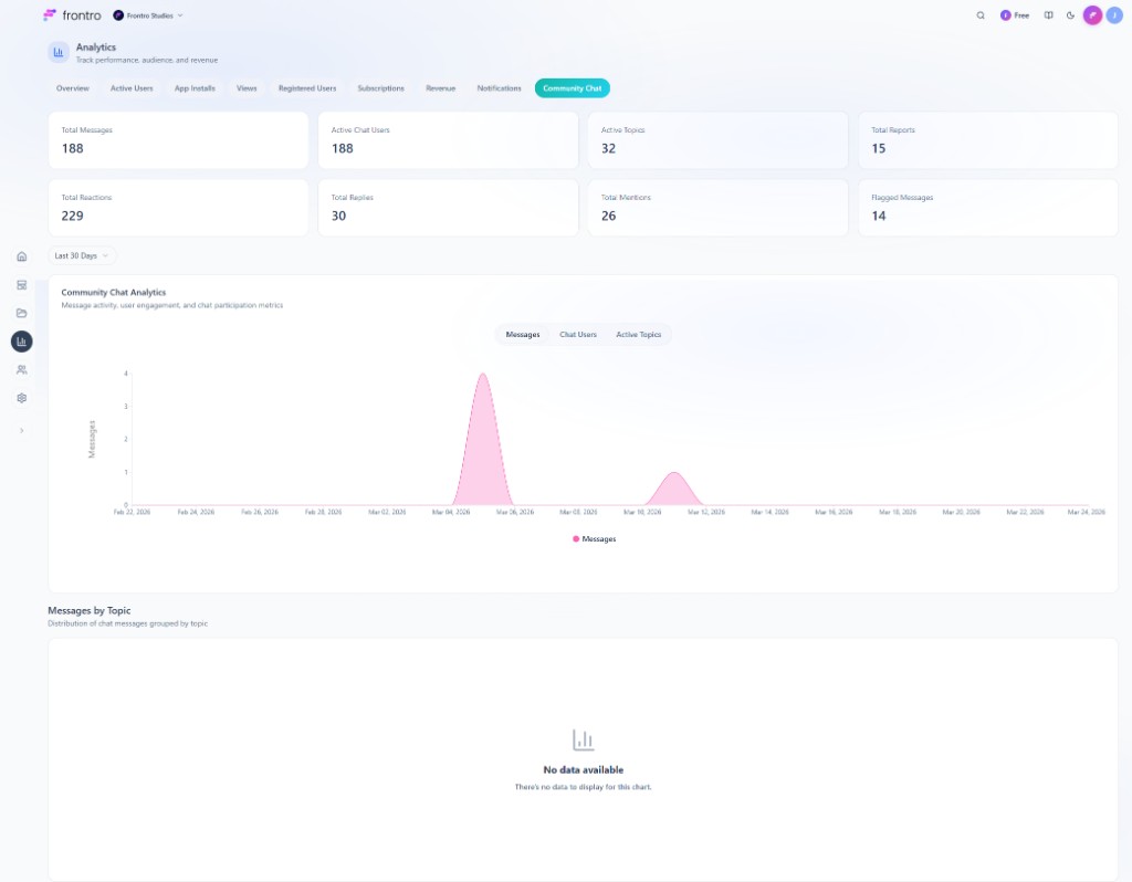
Community Chat
The Community Chat tab summarizes chat health and activity.
- KPI cards — Total Messages, Active Chat Users, Active Topics, Total Reports, Total Reactions, Total Replies, Total Mentions, Flagged Messages.
- Community Chat Analytics — Area chart with sub-tabs Messages, Chat Users, and Active Topics.
- Messages by Topic — Data table (topic name, message count, unique users) and a Messages by Topic pie chart for share of message volume by topic.
Best practices
- Review weekly — Start from Overview, then open the tabs you rely on for decisions about audience, content, and revenue.
- Compare periods — Use the date range to compare last 7, 30, or 90 days, or set a custom range in the date picker.
- Set goals — Tie these metrics to KPIs for growth and revenue.
Related documentation
- Settings for platform configuration
- Channel Content for content strategy
- Apps for mobile app information