Builder
Design a unique channel experience with Frontro's Builder.
Overview
The Builder has two modes: Customize and Build. In Customize mode, the Channel customizer panel (right) controls how your channel looks—logo, typography, nav, hero, cards, players, and so on. In Build mode, the Experience builder panel (right) lists pages and layout blocks; you add and reorder there using the list and drag handles. In both modes the main area is a live preview only—you cannot drag elements on the preview to position them, and you cannot resize elements on the canvas.
Key Features
- Panel-driven layout – Add blocks via + Add Block or + Add Content in the panel; reorder by dragging items in the panel list (drag handles ☰ or six-dot icon), not on the main preview. Block size and style (e.g. Hero height) are set in the Properties tab.
- Live preview – See changes in real time. Use device icons (desktop, tablet, mobile) to preview different screen sizes.
- Two panels – Build mode: Pages, Layout, Properties (pages and blocks). Customize mode: Channel customizer (theme, logo, typography, nav, hero, cards, players).
Device preview
Use the desktop, tablet, and mobile icons in the top bar to switch the live preview between breakpoints while you work in Design (Customize) or Build mode.
Getting Started
Accessing the Builder
- In the left navigation, open Builder (channel/layout).
- Select a page (e.g. Home) to edit its layout.
- The Experience builder panel (right) has Pages, Layout, and Properties tabs. The main area shows a live preview. Use the panel to add content, reorder items by dragging in the list, and set Visibility and Audience. The selected section on the preview is outlined; you edit it via the panel, not by dragging on the preview.
- Switch device preview (desktop, tablet, mobile) as needed. Click Save to apply.
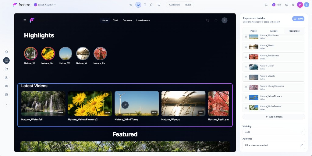
Experience builder tabs (Build mode)
The Experience builder panel has three tabs:
- Pages – List of pages (e.g. Welcome, Home). The active page is highlighted. Sub-items (e.g. Livestreams, Chat, Courses) have drag handles for reordering. Use + Create Page or Dropdown to add pages or menus.

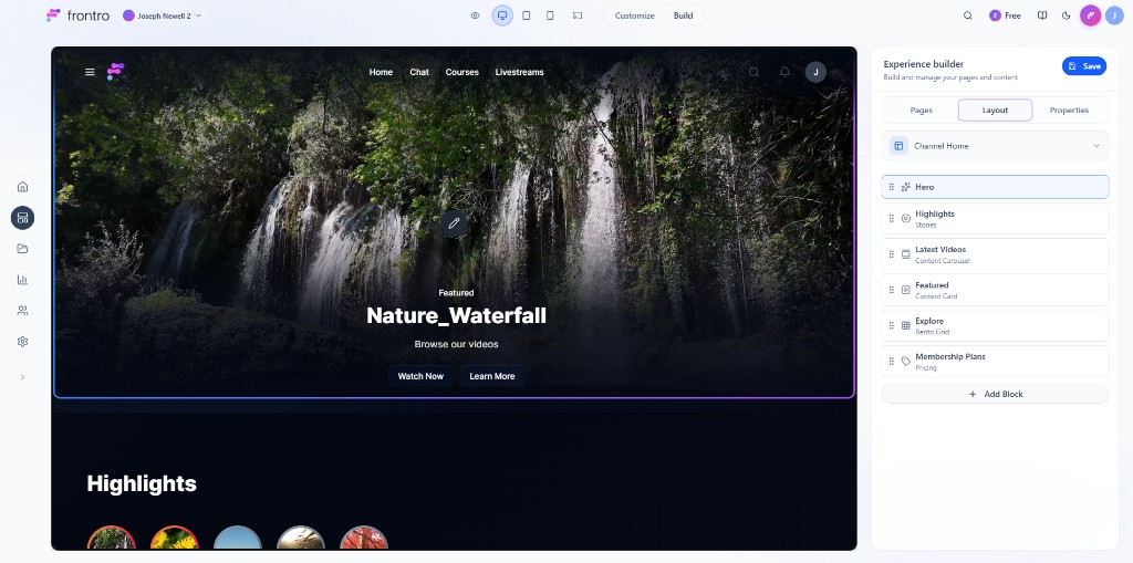
- Layout – For the selected page (e.g. Channel Home), lists layout blocks (Hero, Highlights, Latest Videos, Featured, Explore, Membership Plans, etc.). Each block has a drag handle (six-dot icon) for reordering. Use + Add Block to add sections. Reorder only in this list—not on the main preview.
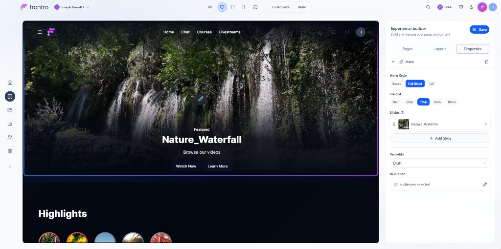
- Properties – When a block is selected (e.g. Hero), shows that block’s settings: Hero Style (Boxed, Full Blood, Tall), Height (50vh–100vh), Slides, Visibility, Audience. No drag-to-resize on the canvas.
Layout components (Build mode)
What viewers see is built from layout blocks you add and order in the Layout tab:
- Content groups and carousels – Add a Content group or Content Carousel block via + Add Block (or + Add Content where shown). Configure it in Properties (title, filters, card style, Visibility, Audience). Reorder blocks by dragging them in the Layout tab list. Click Save to apply.
- Hero – Featured area at the top (image/video, title, CTA). Configure in Properties (style, height, slides).
- Other block types – e.g. Highlights (Stones), Content Carousel (Latest Videos, Featured), Bento Grid (Explore), Pricing (Membership Plans). Each appears in the Layout list; select to edit in Properties.
Your channel layout can include a header (branding, nav), hero section, rows of content (content groups/carousels), and footer. The exact structure depends on the blocks you add and their order in the Layout tab.
Native content types
Incorporate Frontro's native content types for a more integrated experience:
- COURSE shelves: Display collections of course content
- LESSON highlights: Feature individual lessons within courses
Customize mode
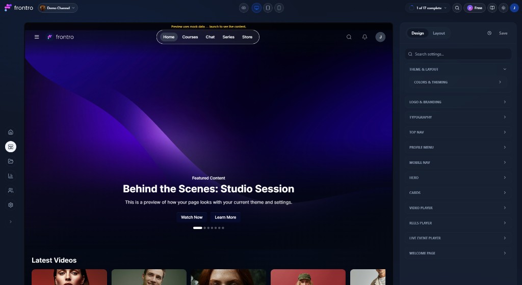
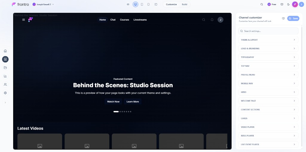
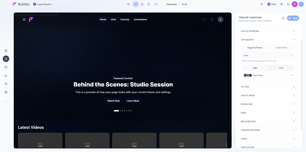
Switch to the Customize tab (next to Build in the top bar) to change how your channel looks. The Channel customizer panel on the right has collapsible sections. All changes are made there; the main area is a live preview only (no drag-and-drop or resizing on the preview).
Channel customizer sections:
- THEME & LAYOUT – Overall theme and layout options.
- LOGO & BRANDING – Show logo, logo placement (top left / top center / top right), logo image, favicon, profile image.
- TYPOGRAPHY – Supported fonts, custom font, text colors, light/dark preview.
- TOP NAV – Show top nav, style (Glassmorphic, Solid, Minimal), alignment, nav pill radius, top-right icons (search, activity, custom links), theme, nav colors.
- PROFILE MENU – Style (Avatar, Blended, Hamburger), profile menu links.
- MOBILE NAV – Show bottom bar, style, placement (Floating, Pinned), labels (Show, Hide), nav items, nav colors.
- HERO – Show overlay, hero carousel, CTA button, hero button style (Glassmorphic, Solid, Minimal), hero button radius.
- WELCOME PAGE – e.g. “Allow Continue as Guest”.
- CONTENT SECTIONS – Options for content sections (e.g. Continue Watching).
- CARDS – Per-card-type settings (Video card, Reel card, Course & lesson card, Live event card, Product card): info position, stats style, and which fields to show (title, views, likes, comments, duration, published date, etc.).
- VIDEO PLAYER – Show related videos, description, comments, featured products, like/share/shop buttons; default viewing mode (Standard, Theater).
- REELS PLAYER – Show comments, like button, share button.
- LIVE EVENT PLAYER – Show chat, description, comments, related videos.
Use the device preview icons to see how settings look on different screens. Click Save to apply.
Theme and appearance (Customize mode)
Brand colors, typography, and visual details are controlled in the Channel customizer sections above: LOGO & BRANDING, TYPOGRAPHY, TOP NAV (and other nav sections) for colors and fonts; HERO, CARDS, and player sections for component-level styling. There is no separate “theme editor” page—all of this lives in the Customize panel.
Advanced techniques
- Conditional layouts – Use conditional sections (where available) to show different content by audience (e.g. member vs. non-member). Configure in the Builder via block or section conditions.
- Testing – Use device preview and Save to iterate; audience and visibility are set per block in Properties.
Best practices
- Mobile-first – Check tablet and mobile preview when changing layout or Customize options.
- Clear hierarchy – Order blocks in the Layout tab so the most important content appears where you want.
- Consistent branding – Use Customize (logo, typography, nav, hero) to keep the channel look consistent.
- Performance – Avoid an excessive number of blocks or heavy media if the preview or live site feels slow.
Troubleshooting
- Order not updating – Reorder in the Experience builder panel list (Layout or Pages tab) using the drag handles, then click Save. The main preview does not support drag-to-reorder.
- Responsive issues – Use device preview in the top bar; adjust Customize options (e.g. MOBILE NAV, TOP NAV) as needed.
- Preview vs. live – If something looks different live, ensure you’ve clicked Save and that the correct page/audience is selected.
Next steps
- Channel Content for organizing content
- Audiences for targeting blocks to specific viewers
- Analytics to measure performance